

Get Started with Material UI and Next.js in TypeScript
Learn how to set up a basic boilerplate with Material UI and Next.js to build beautiful apps quickly and efficiently.


Material UI paired with Next.js is a very powerful combo for quickly building complex apps.
If you tried to re-engineer this stack from scratch, you'd have to invest hundreds or potentially thousands of hours into it before you ever actually started, you know, building your app.
Working with Material UI in Next.js is a breeze once you get everything installed and override a few default settings.
This tutorial walks you through the process of setting up a boilerplate Next.js app in TypeScript with Material UI, using Emotion as a styling engine.
If you want to get straight into the code, you can check out my GitHub repo that contains this boilerplate.
Prerequisites
This tutorial assumes that you are comfortable working with:
package managers (npm, yarn)
command-line interface (terminal)
React
Check out these resources if you need to get up to speed on any of these topics:
Introducing Our Stack
Next.js
Next.js is a React framework created by Vercel. Next makes it incredibly simple to spin up a new React app with complex questions like routing, rendering, bundling, and image optimization already answered for you.
Material UI
Material UI is an open-source React component library that implements Google's Material Design system. It's maintained by MUI, the startup where I currently work as a Developer Advocate.
Like Next.js, Material UI is cool because it enables you to build so much faster. Many of the toughest decisions have already been made for you, so you can build a truly excellent UI without any of the prerequisite design skills. And if you need to change things up, customization is very intuitive.
Emotion
Material UI's styling features are made possible by Emotion, a library for writing CSS styles using JavaScript.
There are a few different ways of working with Emotion, but MUI's styling engine uses the styled.div-flavored API, so the code should look familiar to you if you've worked with styled-components before.
TypeScript
This tutorial uses TypeScript, but don't let that scare you off if you've only worked with JavaScript in the past!
You can still build on top of this boilerplate using JavaScript/JSX, and if you ever decide to translate your code into TS in the future, you can do so progressively—one file at a time—without breaking anything.
Initializing the Project
Create Next.js App
To create a blank Next.js app with TypeScript, navigate to the directory where you want your project to live and run one of the following commands in your terminal:
npm
npx create-next-app@latest --typescript material-ui-next-boilerplate
yarn
yarn create next-app --typescript material-ui-next-boilerplate
"material-ui-next-boilerplate" is the name I'm giving the project here. You can choose anything you like.
Navigate into the new directory you just created:
cd material-ui-next-boilerplate
Install Material UI
Inside your app's directory, run this command to install Material UI:
npm
npm install @mui/material
yarn
yarn add @mui/material
Install Roboto Font
Since Material UI uses the Roboto font by default, let's install that as well:
npm
npm install @fontsource/roboto
yarn
yarn add @fontsource/roboto
You don't have to use Roboto in your app, but we'll stick with it for this boilerplate setup.
Install Material Icons (Optional)
Optionally, you may want to install the Material UI icon pack if you plan to use those:
npm
npm install @mui/icons-material
yarn
yarn add @mui/icons-material
Install Emotion
To install Emotion, run:
npm
npm install @emotion/react @emotion/styled @emotion/server @emotion/cache
yarn
yarn add @emotion/react @emotion/styled @emotion/server @emotion/cache
Dependencies
Now that you have everything installed, your list of dependencies in package.json should look something like this:
// package.json

  "dependencies": {
    "@emotion/cache": "^11.10.3",
    "@emotion/react": "^11.10.4",
    "@emotion/server": "^11.10.0",
    "@emotion/styled": "^11.10.4",
    "@fontsource/roboto": "^4.5.8",
    "@mui/icons-material": "^5.10.6",
    "@mui/material": "^5.10.6",
    "next": "12.3.1",
    "react": "18.2.0",
    "react-dom": "18.2.0"
  },
  "devDependencies": {
    "@types/node": "18.7.21",
    "@types/react": "18.0.21",
    "@types/react-dom": "18.0.6",
    "eslint": "8.24.0",
    "eslint-config-next": "12.3.1",
    "typescript": "4.8.3"
  }
The versions listed here were the latest releases for all packages as of September 2022. I can't promise that all of these packages will continue to play nicely forever when they introduce new versions. I'll do my best to update this guide if breaking changes arise in the future.
Customizing the Project
Create a Theme
Inside your project directory, create a new folder called src and navigate into it:
mkdir src && cd src
Create a new file named theme.ts:
touch theme.ts
Inside theme.ts, add the following code to create a new theme instance:
// src/theme.ts

import { createTheme } from '@mui/material/styles';
import { green } from '@mui/material/colors';

const theme = createTheme({
  palette: {
    primary: {
      main: green.A700,
    },
    secondary: {
      main: '#ff6666',
    },
  },
});

export default theme;
This theme is the source of truth for our app's styles. As you can see, it supports the color palettes that come packaged with Material UI as well as custom colors.
Create Custom Emotion Cache
In order to insert your styles into your Material UI components, you need to create a custom cache to override Emotion's default settings.
In the src folder, create a new file named createEmotionCache.ts:
touch createEmotionCache.ts
Inside, adding the following code:
// src/createEmotionCache.ts

import createCache from '@emotion/cache';

export default function createEmotionCache() {
  return createCache({ key: 'css', prepend: true });
}
Create Custom _document.tsx
By default, Next.js abstracts away the <html> and <body> tags on your pages.
To use Material UI, your theme and createEmotionCache instances need to be able to talk to these tags. This happens in the custom _document file.
The custom _document also lets you set the initialProps for the page, so styles can be rendered on the server before the page is sent to the client.
To override the default _document, navigate to your pages directory:
cd .. && cd pages
Create a new file called _document.tsx:
touch _document.tsx
Inside, add the following code:
// pages/_document.tsx

import * as React from 'react';
import Document, { Html, Head, Main, NextScript } from 'next/document';
import createEmotionServer from '@emotion/server/create-instance';
import theme from '../src/theme';
import createEmotionCache from '../src/createEmotionCache';

export default class MyDocument extends Document {
  render() {
    return (
      <Html lang="en">
        <Head>
          <meta name="theme-color" content={theme.palette.primary.main} />
          <link rel="shortcut icon" href="/static/favicon.ico" />
          <link
            rel="stylesheet"
            href="https://fonts.googleapis.com/css?family=Roboto:300,400,500,700&display=swap"
          />
          {(this.props as any).emotionStyleTags}
        </Head>
        <body>
          <Main />
          <NextScript />
        </body>
      </Html>
    );
  }
}

MyDocument.getInitialProps = async (ctx) => {
  const originalRenderPage = ctx.renderPage;
  const cache = createEmotionCache();
  const { extractCriticalToChunks } = createEmotionServer(cache);

  ctx.renderPage = () =>
    originalRenderPage({
      enhanceApp: (App: any) =>
        function EnhanceApp(props) {
          return <App emotionCache={cache} {...props} />;
        },
    });

  const initialProps = await Document.getInitialProps(ctx);
  const emotionStyles = extractCriticalToChunks(initialProps.html);
  const emotionStyleTags = emotionStyles.styles.map((style) => (
    <style
      data-emotion={`${style.key} ${style.ids.join(' ')}`}
      key={style.key}
      // eslint-disable-next-line react/no-danger
      dangerouslySetInnerHTML={{ __html: style.css }}
    />
  ));

  return {
    ...initialProps,
    emotionStyleTags,
  };
};
Create Custom Link Component
Next.js and Material UI both have their own Link components that won't play well together right out of the box.
In order to fix this, you need to create a custom <NextLink /> component that returns Material UI's <MuiLink />.
Navigate back to the src folder:
cd .. && cd src
Create a file called Link.tsx:
touch Link.tsx
Inside, paste the following code:
// src/Link.tsx

import * as React from 'react';
import clsx from 'clsx';
import { useRouter } from 'next/router';
import NextLink, { LinkProps as NextLinkProps } from 'next/link';
import MuiLink, { LinkProps as MuiLinkProps } from '@mui/material/Link';
import { styled } from '@mui/material/styles';

// Add support for the sx prop for consistency with the other branches.
const Anchor = styled('a')({});

interface NextLinkComposedProps
  extends Omit<React.AnchorHTMLAttributes<HTMLAnchorElement>, 'href'>,
    Omit<NextLinkProps, 'href' | 'as'> {
  to: NextLinkProps['href'];
  linkAs?: NextLinkProps['as'];
  href?: NextLinkProps['href'];
}

export const NextLinkComposed = React.forwardRef<HTMLAnchorElement, NextLinkComposedProps>(
  function NextLinkComposed(props, ref) {
    const { to, linkAs, href, replace, scroll, shallow, prefetch, locale, ...other } = props;

    return (
      <NextLink
        href={to}
        prefetch={prefetch}
        as={linkAs}
        replace={replace}
        scroll={scroll}
        shallow={shallow}
        passHref
        locale={locale}
      >
        <Anchor ref={ref} {...other} />
      </NextLink>
    );
  },
);

export type LinkProps = {
  activeClassName?: string;
  as?: NextLinkProps['as'];
  href: NextLinkProps['href'];
  linkAs?: NextLinkProps['as']; // Useful when the as prop is shallow by styled().
  noLinkStyle?: boolean;
} & Omit<NextLinkComposedProps, 'to' | 'linkAs' | 'href'> &
  Omit<MuiLinkProps, 'href'>;

// A styled version of the Next.js Link component:
// https://nextjs.org/docs/api-reference/next/link
const Link = React.forwardRef<HTMLAnchorElement, LinkProps>(function Link(props, ref) {
  const {
    activeClassName = 'active',
    as: linkAs,
    className: classNameProps,
    href,
    noLinkStyle,
    role, // Links don't have roles.
    ...other
  } = props;

  const router = useRouter();
  const pathname = typeof href === 'string' ? href : href.pathname;
  const className = clsx(classNameProps, {
    [activeClassName]: router.pathname === pathname && activeClassName,
  });

  const isExternal =
    typeof href === 'string' && (href.indexOf('http') === 0 || href.indexOf('mailto:') === 0);

  if (isExternal) {
    if (noLinkStyle) {
      return <Anchor className={className} href={href} ref={ref} {...other} />;
    }

    return <MuiLink className={className} href={href} ref={ref} {...other} />;
  }

  if (noLinkStyle) {
    return <NextLinkComposed className={className} ref={ref} to={href} {...other} />;
  }

  return (
    <MuiLink
      component={NextLinkComposed}
      linkAs={linkAs}
      className={className}
      ref={ref}
      to={href}
      {...other}
    />
  );
});

export default Link;
Now the <Link> component will work as expected in Next.js.
Update _app.tsx
Navigate back to the pages directory:
cd .. && cd pages
Open your project's _app.tsx and replace the default code with:
// pages/_app.tsx

import * as React from 'react';
import Head from 'next/head';
import { AppProps } from 'next/app';
import { ThemeProvider } from '@mui/material/styles';
import CssBaseline from '@mui/material/CssBaseline';
import { CacheProvider, EmotionCache } from '@emotion/react';
import theme from '../src/theme';
import createEmotionCache from '../src/createEmotionCache';

// Client-side cache, shared for the whole session of the user in the browser.
const clientSideEmotionCache = createEmotionCache();

interface MyAppProps extends AppProps {
  emotionCache?: EmotionCache;
}

export default function MyApp(props: MyAppProps) {
  const { Component, emotionCache = clientSideEmotionCache, pageProps } = props;
  return (
    <CacheProvider value={emotionCache}>
      <Head>
        <meta name="viewport" content="initial-scale=1, width=device-width" />
      </Head>
      <ThemeProvider theme={theme}>
        {/* CssBaseline kickstart an elegant, consistent, and simple baseline to build upon. */}
        <CssBaseline />
        <Component {...pageProps} />
      </ThemeProvider>
    </CacheProvider>
  );
}
With all of that out of the way, now you're ready to start building out your app—beginning with index.tsx.
Update index.tsx
Open index.tsx in your project's pages directory and replace the default code with:
// pages/index.tsx

import * as React from 'react';
import type { NextPage } from 'next';
import Container from '@mui/material/Container';
import Typography from '@mui/material/Typography';
import Box from '@mui/material/Box';

const Home: NextPage = () => {
  return (
    <Container maxWidth='lg'>
      <Box
        sx={{
          my: 5,
          display: 'flex',
          flexDirection: 'column',
          justifyContent: 'center',
          alignItems: 'center',
        }}
      >
        <Typography component='h1' color='primary'>
          Material UI v5 with Next.js in TypeScript
        </Typography>
        <Typography component='h2' color='secondary'>
          Boilerplate for building faster.
        </Typography>
      </Box>
    </Container>
  );
};

export default Home;
This boilerplate homepage isn't much to look at, but it gives you an idea of how some of the basic components and styling features work in Material UI.
Launching the App
To test out your boilerplate app, navigate to the root directory (cd ..) and run:
npm
npm run dev
yarn
yarn dev
When you visit http://localhost:3000 the page should look like this:
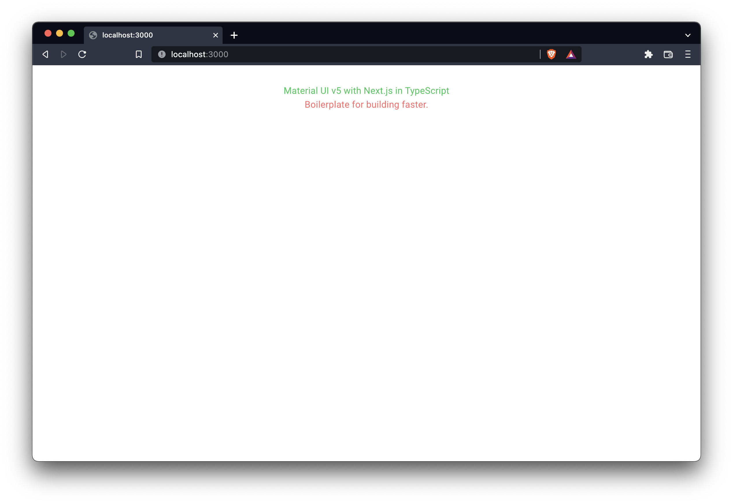
I have to admit, it's not the most beautiful thing I've ever created. 😅
But it is fully functional!
And with all of this setup out of the way, now we can build quickly and efficiently with Material UI and Next.js, with all the benefits of TypeScript.
I hope this is helpful!
If you enjoyed this piece and you want to keep up with my work, you can sign up for my email newsletter through this link. I promise to make every email something you will be excited to open!